The Colours Shaping 2026
Light tends to shift subtly during the winter months. The mornings may feel a little softer, shadows stretch earlier, and our spaces begin to mirror the season’s quieter rhythm. This is the time of year when we naturally look for spaces that do more than appear polished, they need to support how we want to feel, and colour becomes a huge part of this, it shapes atmosphere, guides our rhythm, and creates environments that are restorative, grounded, and considered.
This year, the three brands I’m highlighting are; Benjamin Moore, Sherwin-Williams, and Cloverdale Paint, each of these brands have chosen a Colour of the Year that speaks to this pursuit of balance and intentionality. While Sherwin-Williams’ Universal Khaki provides a versatile, grounding backdrop (explored more fully here), Benjamin Moore’s Silhouette and Cloverdale’s Day Spa 0634 bring a more nuanced depth and emotional resonance, offering deeper insight into how colour can quietly enrich our day to day.
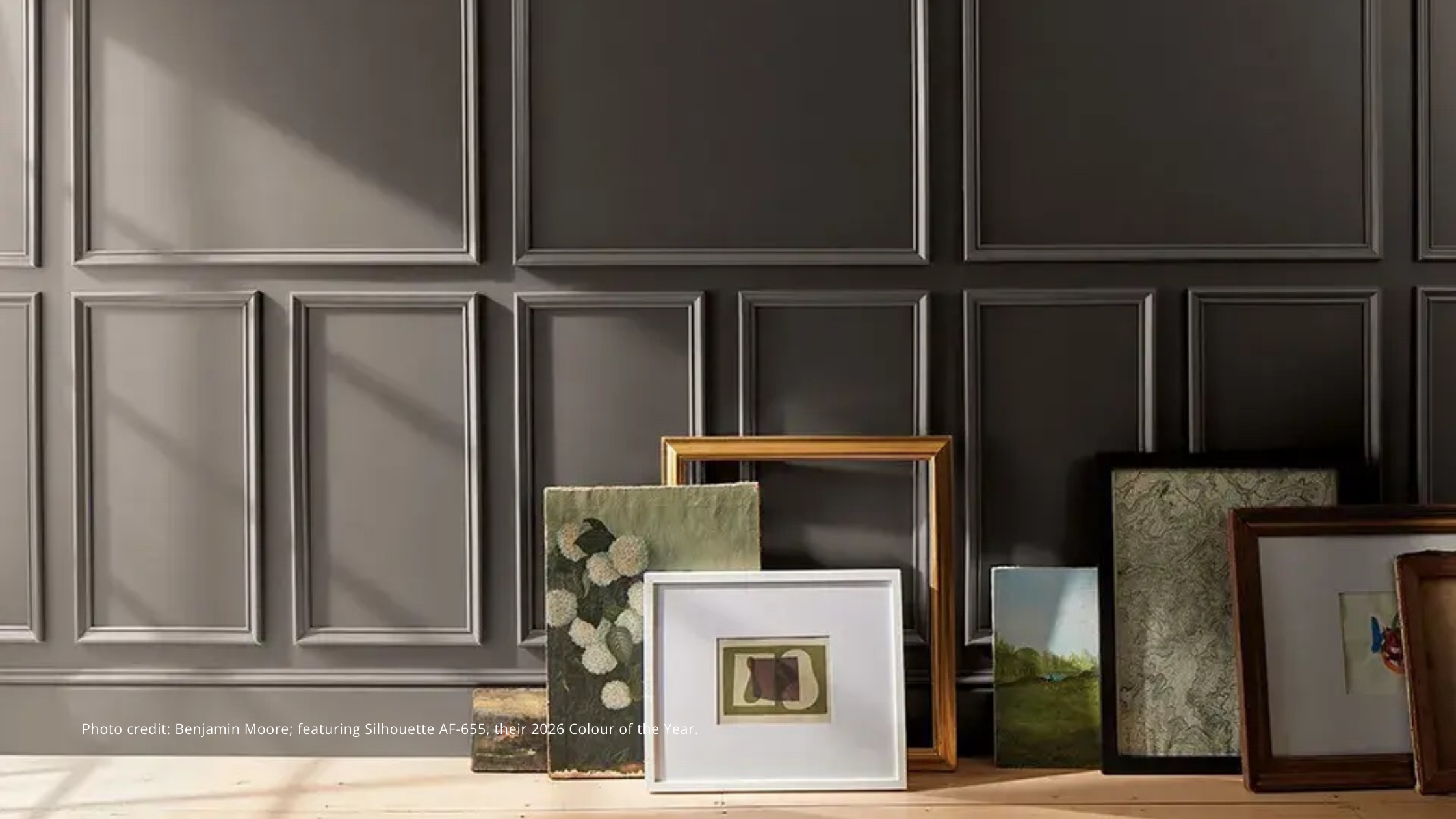
Walking into a room painted in Benjamin Moore’s Silhouette, one almost immediately senses its depth. This is a rich espresso-brown, threaded with subtle charcoal undertones, you find that it absorbs light in a way that invites the eye to settle. In morning light, hints of warmth emerge; by afternoon, it feels cocooned and intimate. It defines a space without overwhelming it. On cabinetry, doors, or an accent wall, it creates zones of focus and reflection, ideal for living rooms, home offices, or even reading nooks.
Let’s go beyond the aesthetic for a while. Dark, grounding tones like Silhouette offer a visual counterbalance in a world that is -let’s face it- very often overstimulated. Hues like these tend to soften the sensory input, encouraging moments of pause, and supporting mindful living. When paired with natural materials like textured linens, warm woods, matte metals, or soft ceramics, its warmth deepens, and as a result, interiors will feel intentional, layered, and restorative.
Cloverdale Paint’s 2026 Colour of the Year, Day Spa 0634, adds a truly distinct Canadian perspective to the palette. This is a sumptuous deep blue, softened by a whisper of aqua, Day Spa echoes the cool clarity of northern waters and the quiet calm found only in coastal and woodland landscapes. It carries a depth that feels both serene and assured, making it appropriate for spaces that would benefit from a sense of refuge, these can include spaces like bedrooms, reading corners, entryways, or any area that is intended for the purpose of ‘winding down’.
What’s intriguing about this hue is its versatility. Though it is rich in tone, it pairs effortlessly with elements like stone, natural wood, ceramics, greenery, and soft neutral textiles, allowing it to move gracefully between contemporary, transitional, and the more naturalistic interiors. The colour supports a sense of grounded tranquillity, think of it as an anchor within a space rather than a statement that demands your attention.
These selections from Benjamin Moore, Sherwin-Williams, and Cloverdale reveal a shared direction, this is a move toward hues that are more grounded, elegant, and supportive of the human experience. They are colours that adapt to shifting light, they age with quiet confidence, and provide a subtle scaffolding for day to day life. They don’t intrude; they guide. They steady. They invite a sense of calm.
For those looking to integrate these hues within their own spaces, I’d like you to consider an experiential approach: I want you to observe how a colour behaves from morning to evening, test it alongside the materials you naturally gravitate toward, and let it shape zones of intentionality; those places for pause, focus, conversation, or restoration. Layer some texture, introduce soft contrast, or incorporate small accent elements to deepen the palette without overwhelming it. Even a single painted wall, a cabinet, or a textile infusion can shift the emotional tone of a space.
Ultimately, the colours shaping 2026 show us that these hues are more than a design decision; it’s a way of crafting an experience, emotion, and wellbeing. When we approach colour with intention; considering things like light, materiality, and daily rhythm, we are creating interiors that support us quietly, yet meaningfully.
For those exploring these tones within their own spaces, online colour consultations are available for guidance. And for projects requiring a more layered, curated approach, tailored colour direction can be developed to support wellbeing, clarity, and a grounded sense of quiet luxury.
As always, I welcome your input.


