Sherwin-Williams’ 2026 Colour of the Year, Universal Khaki
Every so often, a colour that was once considered a background player quietly steps up and reclaims the spotlight. Sherwin-Williams’ 2026 Colour of the Year, Universal Khaki (SW 6150), is a good example of this. This hue has been with us all along, versatile, approachable, and understated, but this year, it takes the stage!
In our studio, we see its return as recognition of what homeowners and businesses are seeking right now: spaces that are grounded, flexible, and enduring. Universal Khaki is NOT a passing trend. It’s a thoughtful choice that allows design to feel stable, intentional, and deeply human.
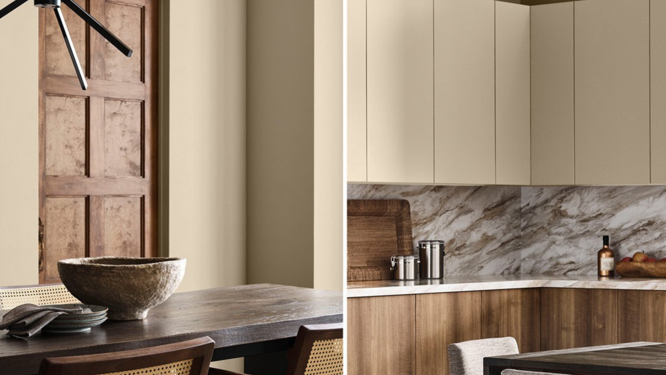
Photo Credit: Sherwin-Williams
WHAT MAKES THIS COLOUR STAND OUT?
Universal Khaki is a warm, earthy neutral with a balance that very few colours can achieve. It carries soft brown and green undertones, giving it a grounded, natural feel without veering too far into yellow or grey. This balance is what makes it so adaptable, you’ll find it can feel equally at home in a modern loft, a traditional residence, or a commercial space.
Many of us will remember “beige” as the default wall colour of the early 2000s. Let’s be clear, Universal Khaki is not that. It is refined, deeper, and richer. It doesn’t disappear into the background, nor is it meant to; instead, it provides an anchoring presence that elevates the elements all around it.
THE PSYCHOLOGY BEHIND THE COLOUR
Colour is never just a visual, it’s very emotional. Khaki tones have long been associated with nature, resilience, and calm. Universal Khaki continues this legacy in ways that resonate with today’s design priorities.
Calming & Centering: The earthy base connects us back to nature, creating that sense of balance. For homes, this can make a living room or bedroom feel more restful. For offices, it provides a backdrop that helps focus without overstimulating.
Neutral but not Bland: While it doesn’t dominate, Universal Khaki brings more depth than a plain white or off-white. This makes it a strong choice for reception areas or meeting rooms where you want warmth without all the distraction.
Adaptable in Mood: Pair it with a deep navy, and it feels sophisticated. Pair it with soft whites, and it’s serene. Bring in some terracotta or burgundy, and it leans warm and inviting. The flexibility of this hue means you can adjust the emotional tone of a space simply by changing what surrounds it.
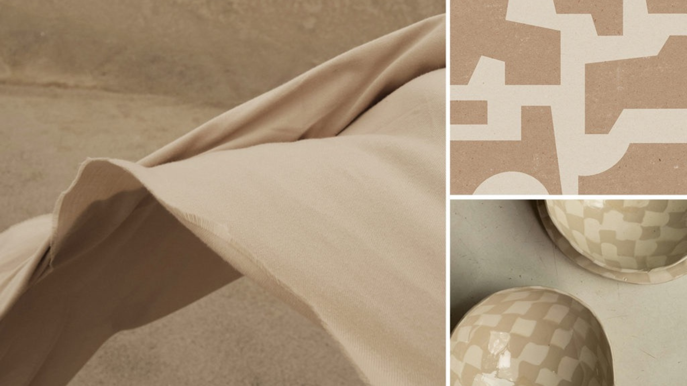
Photo Credit: Sherwin-Williams
PAIRING POSSIBILITIES
The strength of Universal Khaki lies in its ability to complement a wide range of palettes. A few strategies we recommend:
Timeless Neutrals: Paired with Pure White (SW 7005) on trim or cabinetry, khaki feels fresh, crisp, and enduring.
Nature-Inspired Layers: Combine with sage greens, olive tones, or clay reds to echo the outdoors and foster a sense of well-being.
Elevated Contrast: Introduce deep navy or charcoal for a bold, professional look in offices or commercial spaces.
Soft & Subtle Accents: Add muted blush tones or lavender for a residential palette that feels contemporary and serene.
This versatility is what makes Universal Khaki an ideal anchor colour, and one that you can confidently build on for years to come.
WHERE IT WORKS BEST
Universal Khaki suits both residential and commercial interiors, but the effect will shift depending on where it’s applied.
In the Home:
Living Rooms: Creates a grounded backdrop for layered textiles and natural materials like oak, linen, or stone.
Bedrooms: When paired with soft whites or pale greens, it becomes restful and restorative.
Dining Rooms: Adds warmth and intimacy, enhancing the mood of shared meals and conversation.
In Business Settings:
Reception Areas: A welcoming tone that sets visitors at ease while maintaining professionalism.
Boutiques & Cafés: Its neutrality allows products, artwork, or food to shine without the visual competition.
Workspaces: Provides calm focus and avoids the overstimulation that can come with brighter hues, supporting productivity and comfort.
APPLICATION TIPS
Choosing a versatile neutral like Universal Khaki still requires that thoughtful execution. Here are some considerations:
Lighting Matters: In natural light, its earthy undertones are more noticeable. Under warm artificial lighting, it takes on a cozier appearance. Always test swatches at different times of day and night.
Wall Coverage: Use across all walls for a cohesive, enveloping feel, or reserve it for an accent wall to ground the more brighter palettes.
Textures & Finishes: Pair with matte or eggshell finishes in bedrooms and living spaces for softness. Satin or semi-gloss works well in high-traffic or commercial areas for durability.
Material Pairings: Complement with wood, linen, and stone for natural warmth, or pair with glass and metal to elevate its modern sophistication.
WHY THIS COLOUR MATTERS NOW
We believe the choice of Universal Khaki as Colour of the Year 2026 is reflective of our cultural moment. After years of bold, attention-grabbing palettes, design is shifting back toward the more grounding neutrals that offer some stability. It’s not about playing it safe, it’s about creating spaces that last.
For homeowners, that means a colour you won’t tire of in two years from now. For business owners, it means a professional, welcoming atmosphere that can evolve with your brand.
We here at Alleyne & Co. Designs, believe that design should support your health, well-being, and performance. Universal Khaki embodies this philosophy. It restores calm, adapts to changing needs, and brings intentionality back to the foundation of a space.
Universal Khaki reminds us that true design strength often lies in those subtle nuances. This is not a colour chasing the spotlight. It’s a colour that allows everything else; your furniture, your brand, or your daily life, to shine.
Whether you’re refreshing a family home, designing a wellness-focused workplace, or creating a boutique environment, this neutral provides the canvas you can build on with confidence.
The most powerful design choice isn’t the loudest, it’s the one that endures.
If you’re curious how Sherwin-Williams’ Colour of the Year 2026 might translate into your own space, we’re opening a few limited online colour consultation spots this month. Each session begins with a discovery call to understand your vision, light, and lifestyle. [Click here to book yours.]