Colour is one of the most visible decisions in any design project. A palette is selected, finishes are coordinated and colours are assigned to surfaces. Note that colour doesn’t exist in isolation, nor will it behave in the same manner from one environment to another.
A shade that looks appealing on a small sample may feel entirely different when it’s applied across a large area. A warm neutral may take on a cooler appearance in certain lighting conditions, while a richly coloured material may bring depth and add character to a space in ways that paint alone couldn’t achieve.
In spatial design, colour shouldn’t be perceived as simply a finishing choice. It’s part of the composition of the whole environment, and works alongside things like architecture, light and materials to shape how a space looks and is experienced.
So when we think beyond the palette, we’re considering these relationships from the onset.
COLOUR BEGINS WITH SPACE
Before choosing colours, it’s worth understanding the space in which they will be used.
The proportions of a room, the height of the ceilings, the placement of openings and the relationship between adjoining areas, all these influence how colour contributes to the overall design choice. A colour may be used to create continuity between spaces, distinguish one area from another, draw attention to an architectural feature or bring visual balance to a room.
The same colour applied to a ceiling, a wall or a built-in element will have a different presence. Its effect is influenced not only by the surface it occupies, but also by the surrounding forms and finishes.
This is why selecting a palette without ever having considered the architecture could potentially lead to decisions that look disconnected from the space itself. Colour should respond to the environment, and not simply be applied to it.
THE INFLUENCE OF LIGHT
Light is one of the most significant influences on how we perceive colour.
Natural light changes throughout the day, and is influenced by orientation, weather, season and the position of the sun. Artificial lighting introduces a whole other layer, with different light sources affecting how colours and materials may appear.
A colour viewed in a showroom or under a particular set of lighting conditions can look very different once it’s introduced into its intended environment. Even within one room, a surface may appear to shift in character as daylight moves across it.
Therefore, light should be considered an essential part of the colour selection. Samples should be viewed in the space where they are intended to be used, and under the lighting conditions that form part of daily life.
Light also reveals the qualities of materials, from the subtle texture of a matte finish to the reflections of a polished or metallic surface. Its relationship with colour therefore needs to be considered alongside the finishes selected for the space.
COLOUR, MATERIALS AND FINISHES
Colour is only one part of the visual and tactile character of a space. The materials and finishes selected alongside it are as equally important in determining how the completed environment looks, feels and functions.
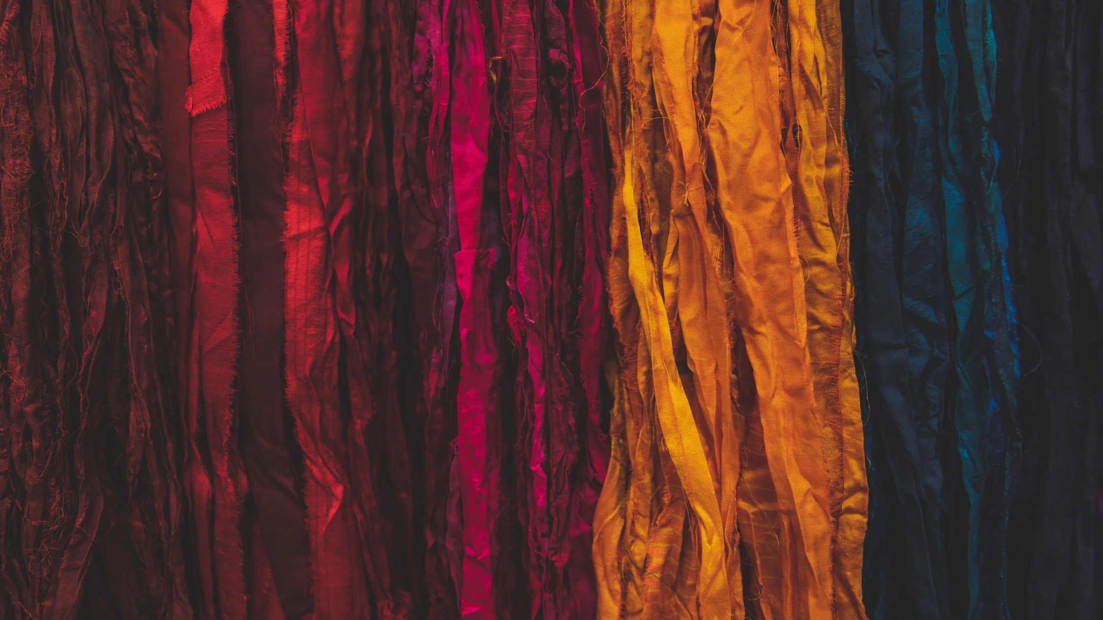
Consider the difference between a painted surface, natural timber, stone, metal or a textile. Each of these has its own unique qualities: grain, pattern, texture, reflectivity, sheen and tonal variation. These characteristics all influence how colour is perceived, but they also contribute something distinctive to the overall composition.
A warm neutral, for example, will have a different presence when applied to a smooth matte wall than when it appears in a textured fabric or alongside a richly grained timber. The colour may be similar, but the material now changes its character.
This is the thinking behind CMF — Colour, Materials and Finishes. In product development and spatial design, CMF considers how these elements work together to establish the appearance, character and practical qualities of a finished product or environment.
It involves looking beyond whether individual selections are attractive in isolation. How will they work together? Will their tones, textures and finishes complement one another? Are they appropriate for the intended use? How will they wear, age and be maintained?
All of these are important considerations, a successful material palette needs to do more than just look cohesive on a presentation board. It should translate into a considered, workable composition within the finished space.
When colour, materials and finishes are developed together, they now provide a stronger foundation for the design rather than a colour palette alone.
COLOUR AND THE HUMAN EXPERIENCE
Beyond its visual contribution, colour plays a part in how we interpret and relate to our surroundings.
It can help establish a sense of identity, create visual distinction between areas, draw attention to particular features or contribute to the overall atmosphere of an environment. Contrast can help make elements easier to identify, while continuity can create a sense of visual cohesion between spaces.
However, the experience of colour is not universal. Personal associations, cultural influences, memory and individual preference will all contribute to how people respond to their surroundings. The same colour may feel familiar and comforting to one person, while someone else may experience it in a different capacity.
For this reason, let’s move beyond simple assumptions about how particular colours are supposed to make people feel. Rather than assigning fixed emotional meanings to individual hues, a more considered approach looks at colour within its context: the space, the materials, the lighting and the people who will use it.
The intention is not to prescribe an emotional response, but to make informed design decisions that support the purpose and character of the environment.
THINKING BEYOND THE PALETTE
All in all, a considered approach to colour begins well before any final selections are made.
It starts with understanding the brief, the architecture and the intended use of the space. From there, colour, materials and finishes can be developed as a coordinated direction, taking into account the practical requirements of the environment as well as its visual character.
What does this all mean? We have to look at the relationship between individual selections, testing samples in context and considering how the composition will translate from the design stage into the finished environment.
The process calls for way more than an appreciation of colour combinations. It requires an understanding of materials, surface qualities, lighting and the role each element plays in the overall design.
Colour is but one of the elements that gives a space its identity. It can connect architecture and materials, create distinction and continuity, and contribute to the character of an environment.
When it’s considered from the outset, rather than added at the end, it becomes more than a palette of selected shades. It becomes an integral part of the spatial design itself.